 Bookmark this on Delicious
 Recommend to StumbleUpon
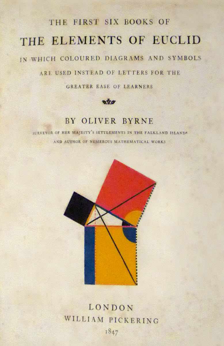
In 1847, a gorgeous book was released by the publisher William Pickering... a mathematics text book covering the first six books of what Euclid's teachings. The author, Oliver Byrne, thought that he had a way to present the material which might be more "pupil friendly".
(I'm delighted to be able to tell you, by the way, that a gorgeous modern facsimile has been produced: 21cm x 26cm x 4cm (comparable to original), 2013, published by Taschen (Germany, www.taschen.com), ISBN 978-3-8635-4471-9)
And he and the publisher worked together to produce a beautiful book, which might also be useful in furthering the reader's grasp of mathematics.
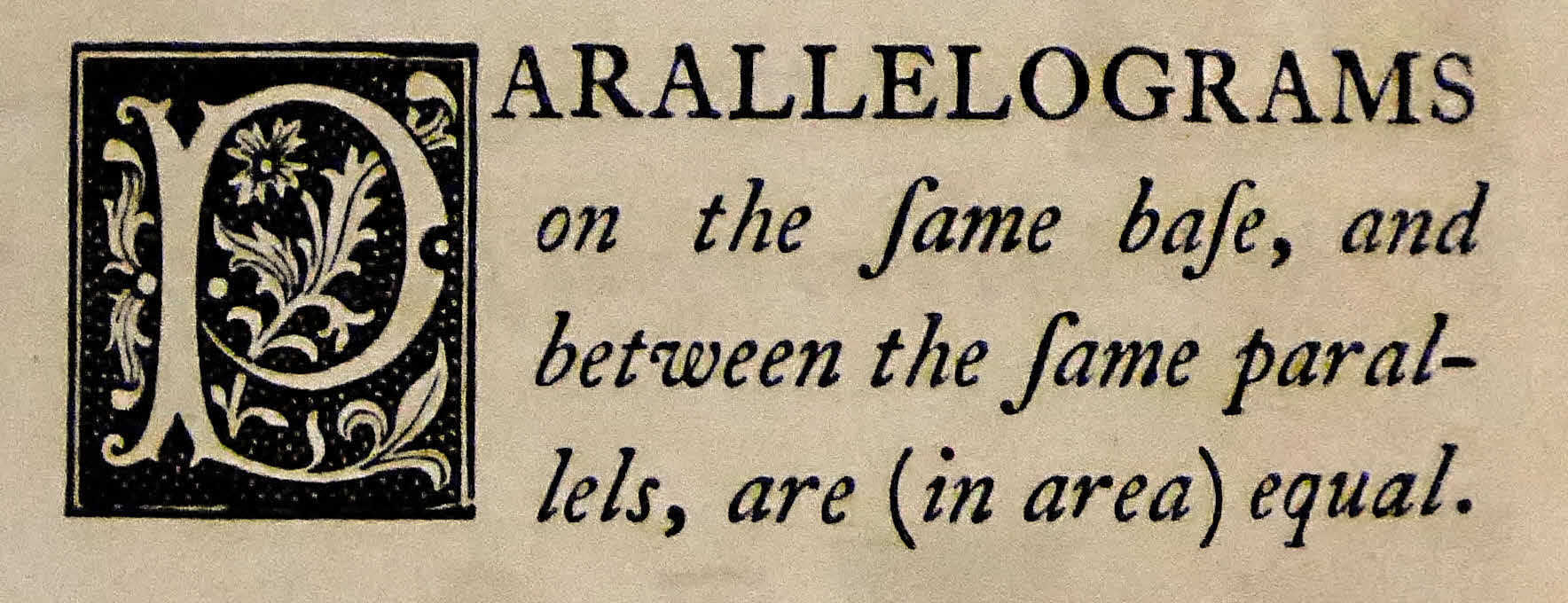
Note the gorgeous capital in the following, for instance....
Sadly, the paper the book was printed on, so I am told, was not of the same quality as the design of the pages... the images on this webpage have been "cleaned up", to remove foxing and bleed-through.
My thanks to Henry Sotheran's, London for the opportunity to photograph the book..
I should stress that in order to try to recapture the original impact of the book, I have "cleaned up" the images with Serif's PhotoPlus.
The images don't, I hope, distort or misrepresent the contents of the book. No text or illustration has been removed or inserted... but the paper this magnificent book was printed on (I am told) just wasn't of a high enough quality, and almost all copies suffer from the fact. I have removed some bleed-throughs, foxing, etc.
(I did slightly reposition one line of text to restore "balance" in the bit of a page I extracted.)
In which coloured diagrams and symbols
are used instead of letters for the
greater ease of learners
Surveyor of Her Majesty's Settlements in the Falkland Islands
and Author of Numerous Mathematical Works
London
William Pickering
1847
See how you get on with understanding the two propositions set out below. (They are unrelated)
-------------
If the old- style "s"s, which look much like an "f", are a distraction for you, note that they do not have the horizontal cross bar that the "f"s have.
-------------
Don't be fooled by Byre's "greater than" and "less than" symbols. They are not as close to the modern ">" and "<" (respectively) as you might think. His "rectangle- missing- one- of- the- vertical sides" greater-than and less-than signs have the missing side near the smaller quantity... more or less the reverse of what you might expect, if you're familiar with > and <.
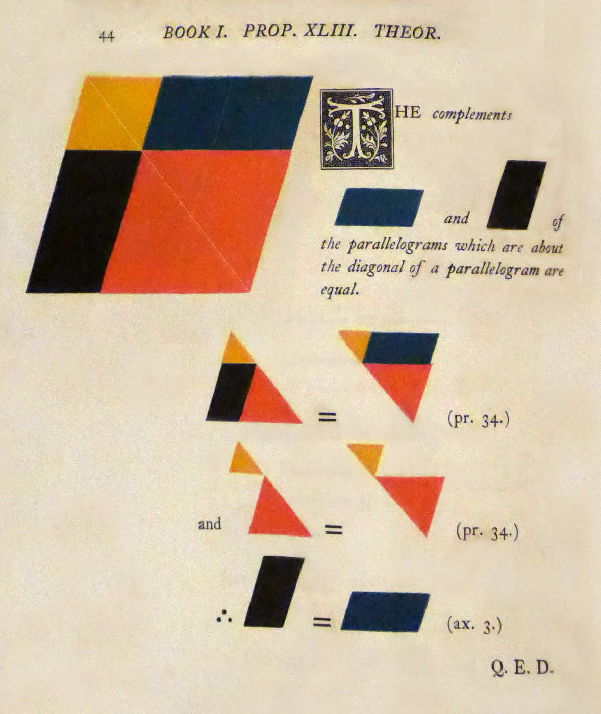
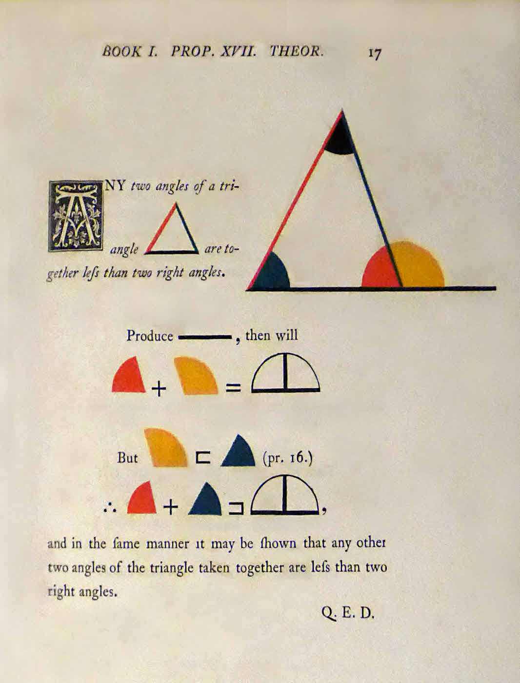
Gorgeous, don't you think?
The style reminded me of something much more modern... Arts and Craft? Wm Morris? Art Deco?
Search across all my sites with the Google search button which I have provided at the top left on the page to which the link will take you.
Or...
Search just this site without using forms,
Or... again to search just this site, use...
The search engine merely looks for the words you type, so....
*! Spell them properly !*
Don't bother with "How do I get rich?" That will merely return pages with "how", "do", "I", "get" and "rich".
This page's editor, Tom Boyd, will be pleased if you get in touch by email.
![]() Page tested for compliance with INDUSTRY (not MS-only) standards, using the free, publicly accessible validator at validator.w3.org. Mostly passes. There were two "unknown attributes" in Google+ button code. Sigh.
Page tested for compliance with INDUSTRY (not MS-only) standards, using the free, publicly accessible validator at validator.w3.org. Mostly passes. There were two "unknown attributes" in Google+ button code. Sigh.